TwitchCon
TwitchCon 2019 represented the first major public appearance of the refreshed Twitch brand identity. While the core Twitch identity predominantly relied on purple, white, and black, the goal with the TwitchCon identity was to blow the palette open.
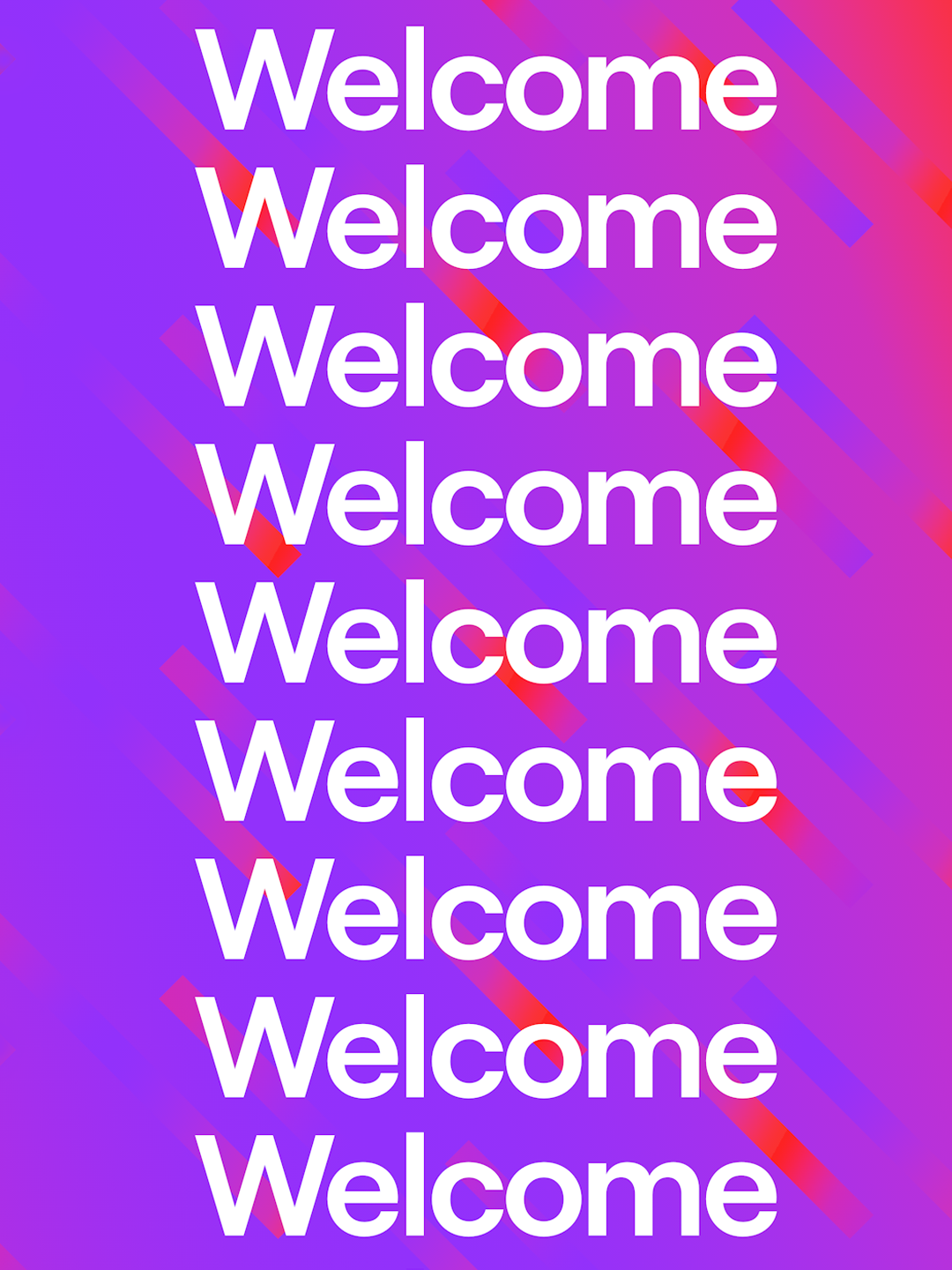
With TwitchCon, we pushed our usage of color and bold typography to the max. Our goal was to create something that felt truly different than our past identities, while still feeling at home in the new brand architecture.
Role: Motion design, graphic design
ECD: Byron Rex Phillipson
AD: Sam Johnson

Maximizing Color
One of the things we focused on with the evolution of Twitch's new brand system, is bringing color back into the brand. Before the refresh, the brand stuck to white and purple for the majority of it's expression. With the new brand, we wanted to bring color and gradients into focus.