A brand ready for a bigger stage
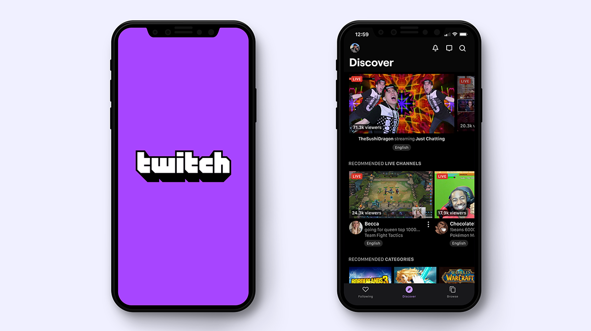
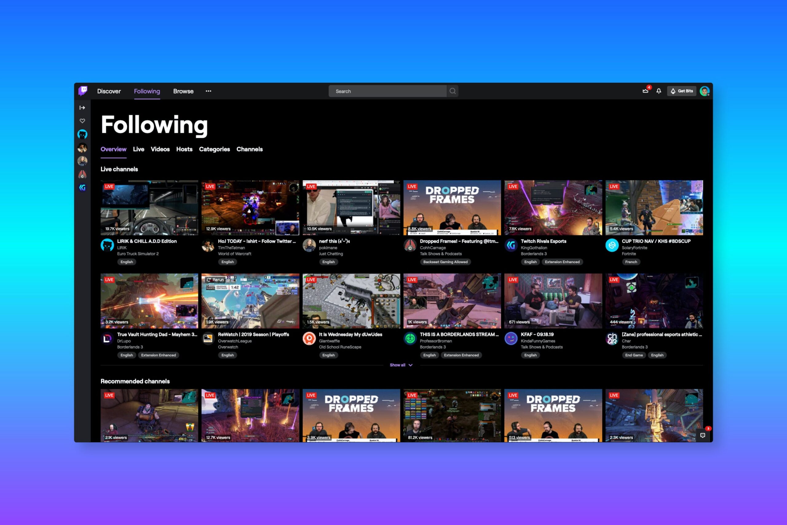
By 2018, Twitch had outgrown its first visual identity. The brand was well known, but it needed to feel sharper, more modern, and easier to use across a growing number of markets and surfaces. Twitch was also preparing to bring the brand to a much larger global audience, which made a flexible system more important than a single polished logo.
I had been at Twitch for several years and had been the company’s sole motion designer throughout the lifespan of the original identity. That history gave me a close working relationship with the brand, but it also made the refresh more specific: I wasn’t creating motion language for a brand I had just met. I was helping it change without losing the parts people already recognized.
Turning a static identity into motion
COLLINS joined Twitch to lead the static identity and brand strategy. They developed the refreshed wordmark, the creator-color system, the typography, and the broader visual language. I owned the motion work that became part of the final brand system and rollout.
The process was collaborative and iterative. COLLINS would share new identity explorations, and I would bring them into motion to test how they behaved over time. Those studies became another way to evaluate the identity. A mark that looked strong in a still image could feel stiff, generic, or overly polished once it moved, so animation helped us understand what the system was really saying.
We went back and forth throughout the project, using motion studies to push the static work and using the evolving identity to expand the motion system. The final direction needed to feel unmistakably Twitch: quick, organic, internet-native, and a little unpredictable without becoming noisy.
Making Twitch feel like Twitch
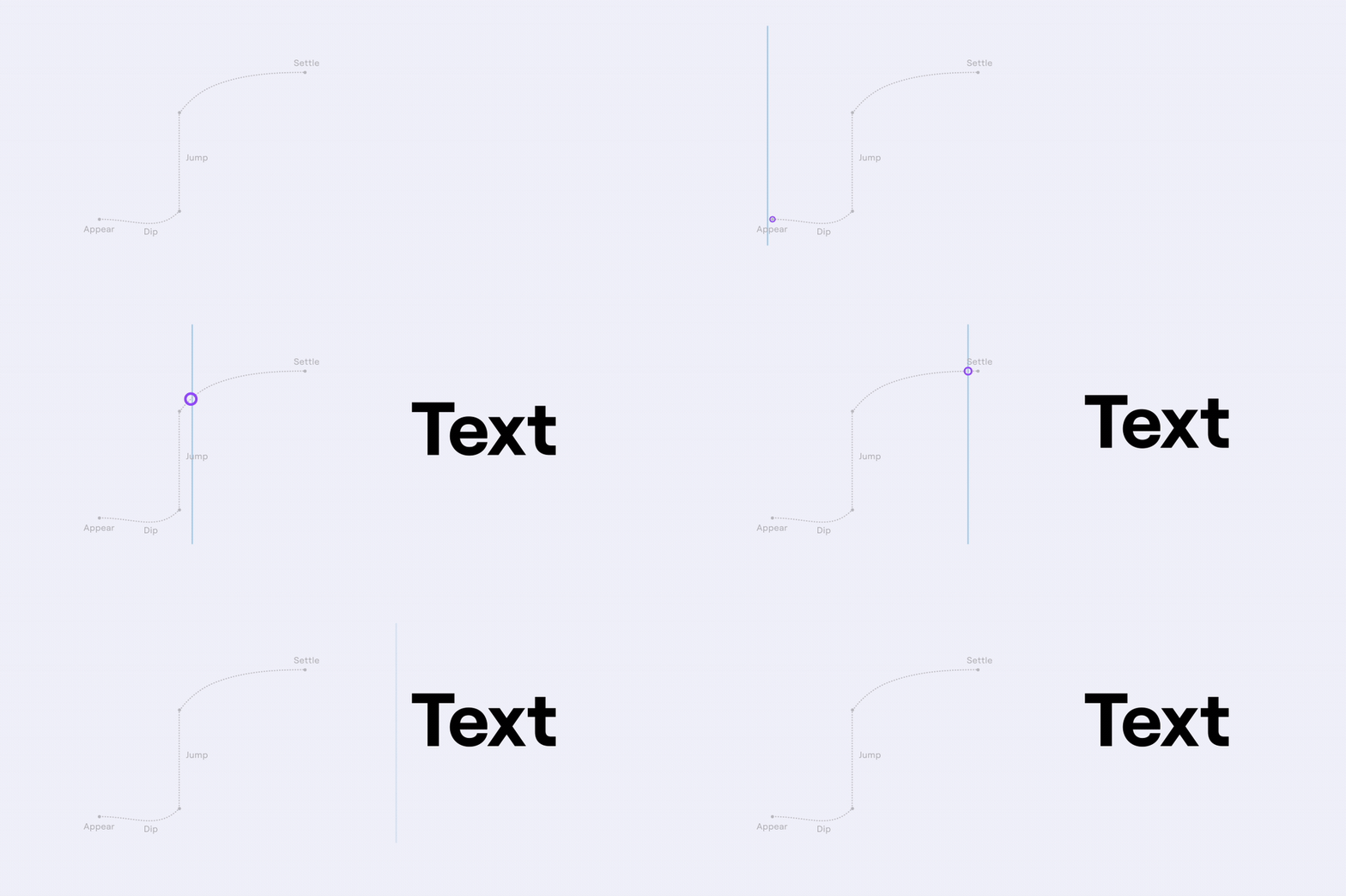
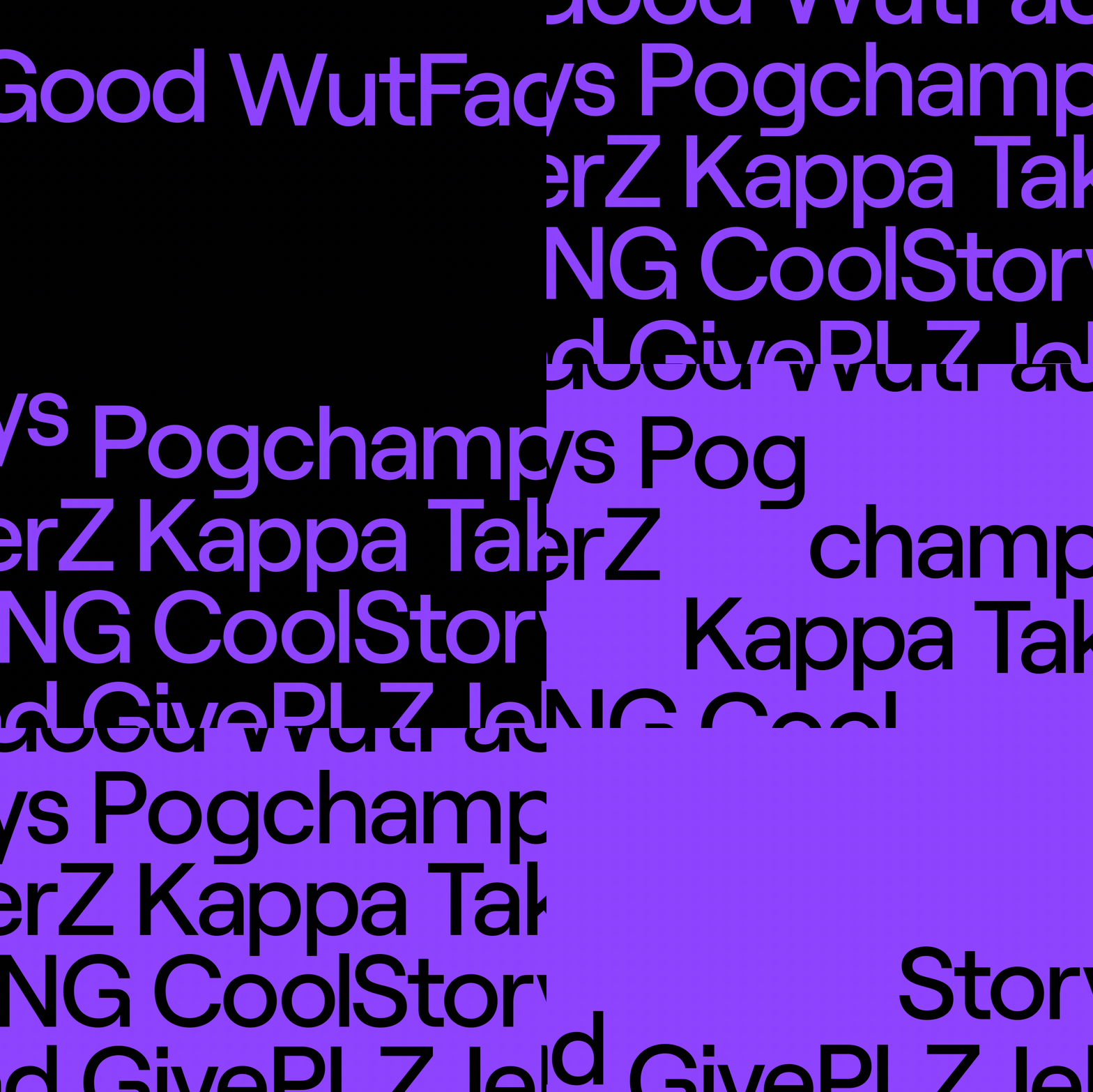
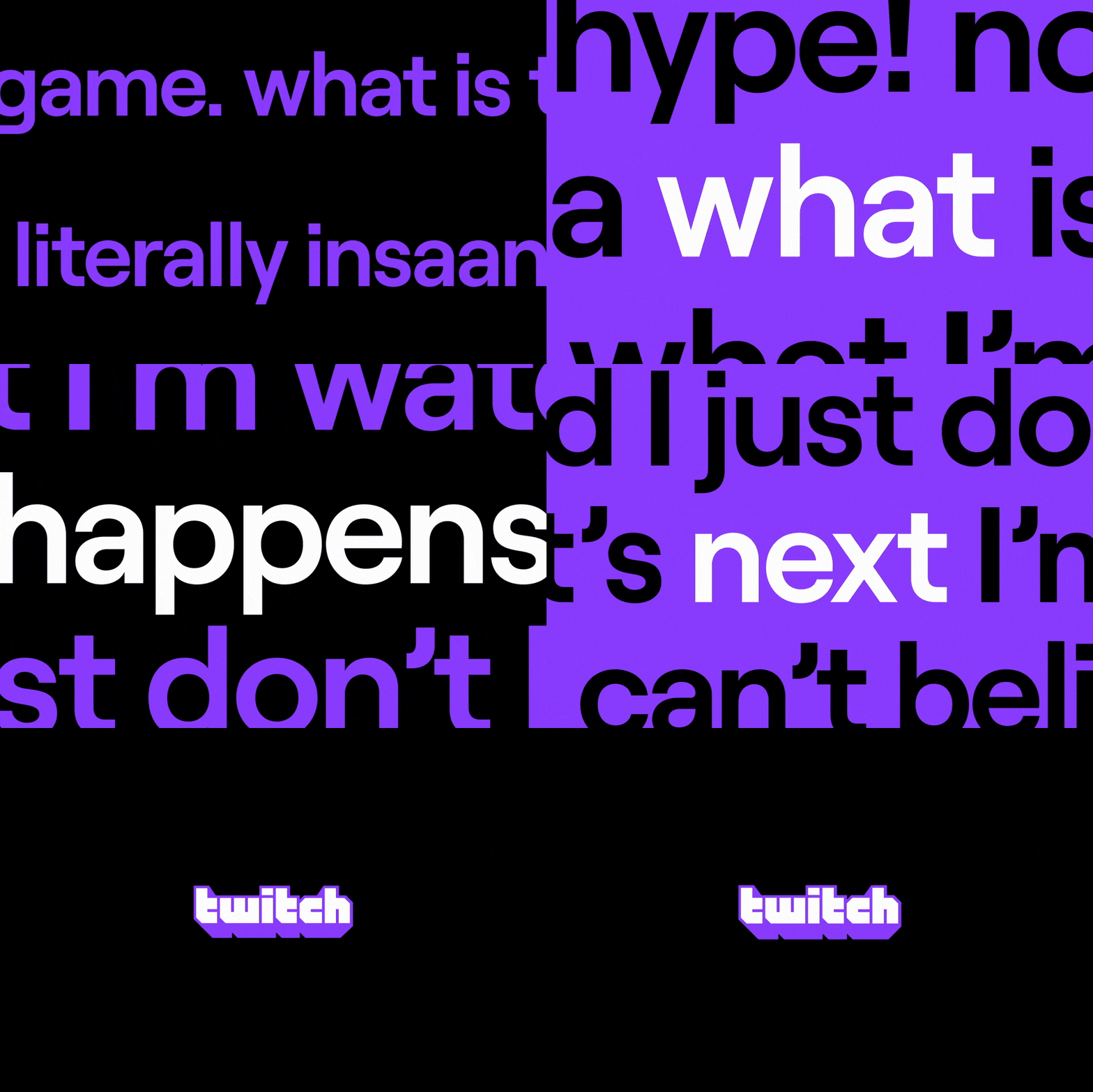
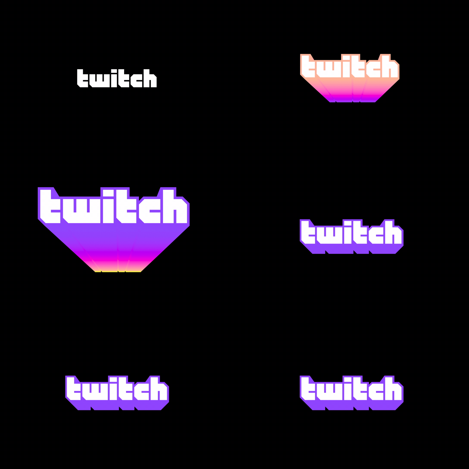
Twitch is a copy-driven brand with a distinct voice. The motion system therefore had to define more than how a logo entered and exited. It needed to establish how words appeared, how long they stayed on screen, how emphasis accumulated, and how animation could support the wit and immediacy of Twitch copy.
I treated timing and typography as part of the writing. The type could snap into place, jump slightly, or build through a sequence of emphases that felt closer to the rhythm of chat than to a traditional corporate brand film.

Keeping the Glitch alive
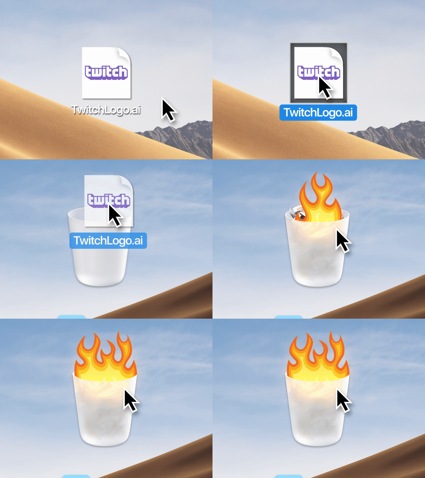
The Glitch icon needed personality, but not so much personality that it became a character. I wanted it to feel alive through movement and timing while remaining clean enough to work as a durable brand mark.
That meant resisting overly soft or playful animation. The icon could shift, stretch, and respond, but it still needed to read immediately and behave appropriately across a wide range of brand applications.



A flexible gradient engine
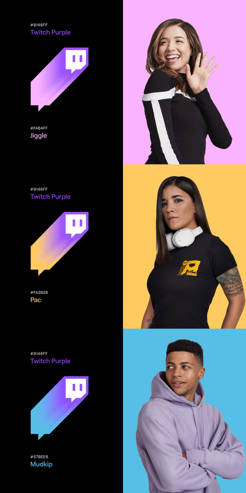
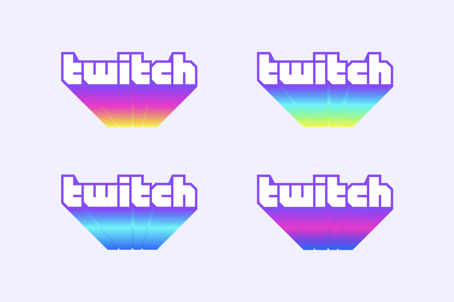
The refreshed identity introduced creator colors alongside Twitch purple. The system needed to support those combinations without turning every new application into a bespoke animation job.
I built a custom Cinema 4D setup that could push the extruded wordmark and Glitch icon through different color combinations without rebuilding the animation from scratch. That made the identity flexible enough to speak to individual creators while keeping the underlying motion language consistent.



Putting the system into production
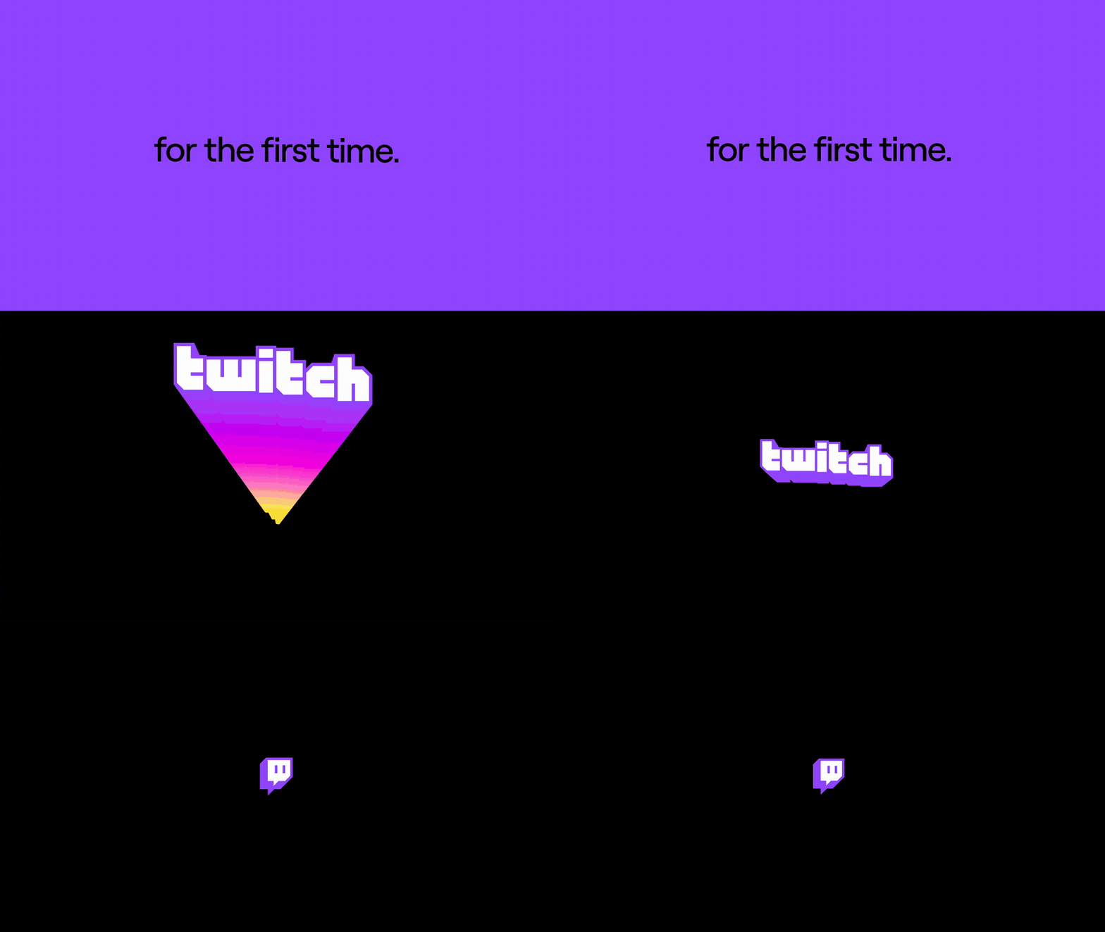
The refreshed identity launched with Twitch’s first brand campaign. I created and shipped the brand film, then worked with MediaMonks, Twitch’s production vendor, on the rest of the campaign. I provided creative direction, guidance, and review throughout production so that their work stayed consistent with the new motion system.
The system was designed to work beyond one film. It gave Twitch a repeatable way to animate its marks, copy, colors, and campaign graphics across different formats and production teams.



A system that made the refresh usable
The refresh rolled out through Twitch’s first brand campaign and the broader Twitch brand. My contribution was the motion system behind that rollout: a set of behaviors that made the refreshed identity feel immediate, expressive, and recognizably Twitch across films, typography, marks, gradients, and campaign production.
Media coverage
- Variety — Twitch brand redesign and first marketing campaign
- Creative Review — Twitch’s first ever brand refresh is all about its community
- Fast Company — Twitch is rebranding for the first time, and it has a logo for everyone
- Adweek — Twitch Tweaks Its Visual Identity
- Creative Bloq — Twitch’s rebrand is here – and you’re already part of it
- Twitch — Nice to meet you again, for the first time
Credits
- Role: Motion Design, Editing
- Executive creative director: Byron Rex Phillipson
- Art direction: Sam Johnson
- Copy: Evan Freitas
- Agency: COLLINS